There are many ways that statistics, data visualization, and language can be used propagandistically. It is often easy enough to identify propaganda by its form or source: we recognize immediately that a poster of Uncle Sam put out by the U.S. Government is serving a propagandistic purpose. However, when it comes to the use of statistics by way of infographics, academic papers, etc., the average person may have a tougher time putting on the metaphorical They Live Glasses that enables them to see what’s going on.
One of the more pernicious behaviors of our current wave of Abundance™️ YIMBY-brained technocrats is to engage in this sort of math-based obfuscation in an arrogant and often incorrect way. This group of people seemingly loves to rationalize their market-driven, pro-capitalist policy preferences as objectively correct by browbeating their audience with math and language that they themselves frequently misunderstand.
The topical example that prompted this post is one that falls into my decade-long frustration with this sorta thing, and relates to what seems like a religious myth amongst this crew about the famously Weird city of Austin, TX. In their minds, whatever happened to Austin during and after the pandemic somehow represents a success of deregulatory YIMBY policies backed by a mostly supply-centric view of ₛᵤₚₚₗy ₐₙd dₑₘₐₙd dynamics.
Lies, Damn Lies, and Whatever This Is
The recent report from Pew exemplifies the typical sort of lazy, propagandistic pseudoscience employed to justify this myth, which is ultimately only supported only by facile chart worship, bad statistics, and rhetorical browbeating of a non-technical audience. In what is dishonest and extremely on-brand, the title of this article is “Austin’s Surge of New Construction Drove Down Rents”.
For a normal reader, the implication is:
- There was a “surge of new construction” in Austin over some time period.
- “Rents”, in terms of the particular way that they decide to measure them, are now lower.
- The cause of that decrease in “rents” is the “surge of new construction”.
They want to use this to broadly advocate for a deregulatory approach to “unlock housing supply”, implying that the primary impediment to affordability is a lack of supply and freedom of the price-reducing mechanisms of supply and demand to work their magic. They say as much explicitly, which more-or-less represents the Abundance™️ YIMBY party line:
Austin’s success serves as an important example of how regulatory barriers to building more housing are often varied and interconnected. No single solution can solve a housing shortage, but Austin has taken multiple steps that have helped to unlock large amounts of housing supply in its market and reverse rent growth, including rent for tenants of lower-cost, older apartments. The city continues to take forward-looking steps—among them reforming building codes, streamlining permitting, and facilitating the construction of small apartment buildings—to reduce housing underproduction and improve affordability for existing and future residents.
In Obamanian terms, let me be clear: this summary is entirely unsupported by any evidence presented in this article.
Some Very Bad Charts
There’s a lot to say about the textual content of this article, but given the predilection of the crew in question to do chart worship, let me lead off with two of the charts they present in the article to indicate the broader problems.1
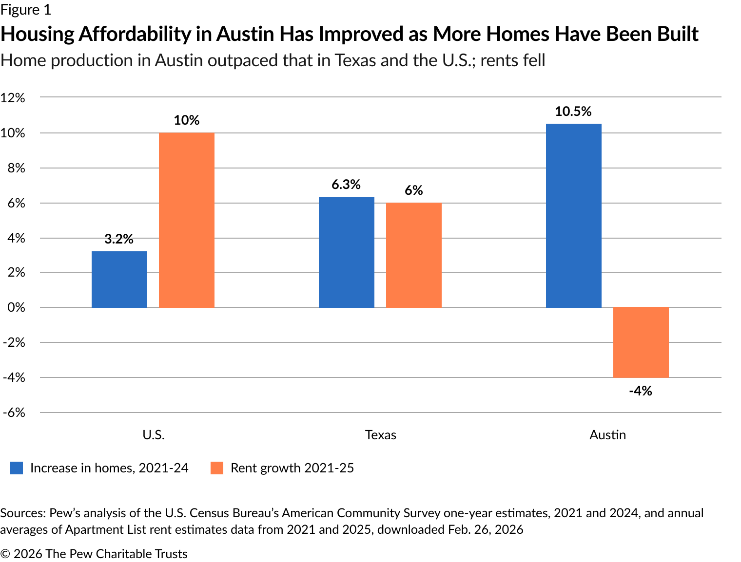
The first chart is one that supposedly shows how Austin is better from other geographic entities in terms of overall affordability, with the explicit claim that this is because of a Supply Increase.
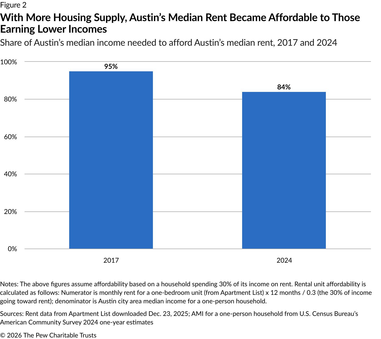
The second chart is meant to make the point that housing became more affordable for lower-income people, again due to whatever policies were enacted and a subsequent Supply Increase.
These two charts (bad) are enough to serve as running examples to pick apart the general problems with the article as a whole. In the words of one of my favorite Italian-Americans: “Let’s-a-go!”
What’s in a Name?
“Housing Affordability” in the first chart is equated with “relatively lower increase in rents”. Of course, if rents were already unaffordable, then slowing their increase does not “improve housing affordability”.
Indeed, in Austin, the prior decade showed massive growth in Austin’s rents by any sensible measure. The figures in the article itself mention this - Austin’s 2026 median rent was substantially above its pre-boom level. Things were already unaffordable for many for a while.
It’s also worth noting that the scale of this rental increase also corresponds to a marginal decline that likely doesn’t change the broader landscape of affordability - a rent drop from $1,546 to $1,296, say, does not make housing particularly accessible to households that were already priced out at the higher rate. They already left or have to live in existing subsidized housing, wherein this rent reduction amounts to a discount for people that could already afford the $1,546 rent. Sure. Great.
The figure in the Pew article makes this even clearer: they claim that affordability improved from 95% AMI to 84% AMI for a one-bedroom. This means that rent remained unaffordable to anyone below 84% AMI, which doesn’t sound like some sort of massive Policy Triumph to me. Their attempt to turn this into a win for equity by pointing to disproportionate decline in rents in “Class C” units also falls flat, by their own logic. I’ll discuss this later.
To note: the scale of the supposed rent decline is related to the so-called “ratchet effect”, where housing prices are sticky downward (a fact that everyone who has looked for apartments knows). It’s just generally difficult to “naturally” lower rents once they have been raised, which should immediately prime us to skepticism around market-based solutions to the problem of high rents.
Grouping
The first chart also runs into the issue of the choice of groups used to aggregate the statistics. The aggregates presented are arbitrary and completely decontextualized. For example, the presentation of similar statistics in the broader U.S. and in the state of TX simultaneously is meant to imply that Austin is meaningfully doing better by some universally coherent metric (“Housing Affordability”) that applies equally well to states, countries, and cities.
There are about a million contextual geographic and temporal factors that need to be taken into account to start considering The City of Austin as a comparable geographic unit to The Entire United States. These are obviously not the same type of thing.
We might call this a category error: cities, states, and countries are simply not the same type of thing! There’s no reason to expect, therefore, that even sensibly-defined statistics associated to them might be comparable without some sort of significant adjustments that reflect these differences.
As a matter of statistics, the choice of how to group things together can completely change the results of calculations. See the examples associated to Simpson’s Paradox, wherein the choice of aggregate can completely flip or negate the relationship between two things. This means that these choices of aggregate need to be principled, or they can just give correlational results that are completely wrong.
Time After Time
The time period focused on is both truncated and aggregated. We don’t get any indication of what happened before 2021 (were there existing trends in Austin that should be taken into account?!), what happened since then, or even how things were happening per-year during those years. This has some very clear problems.
If Austin rents peaked near the beginning of 2021, then it’s necessarily the case that rents declined since then, and what happened before 2021 matters quite a bit. Indeed, in Austin, rents in Austin nearly doubled from 2010-2021, and so there might be a partial explanation of the downward trend as a simple “regression to the mean”.
This temporal analysis also ignores the nature of building construction, which happens on a lag associated to things like permitting, physical construction, etc. As presented, the timing of construction completion and rent movements is obscured, which makes it difficult to look at things at the resolution needed to check for any causal relationship.
Lower rents? For who?
Part of the rhetoric and ideology associated to Abundance™️ is an insistence that their deregulatory, market-based solutions are, in a cheeky Freakonomics counter-intuitive way, actually beneficial to those with lower incomes, the working class, etc. The Pew article attempts to make this point with the second chart above.
Besides that, new issues arise. For one, the framing of the result is dishonest. They equate a slight lowering of the (very high!) minimum AMI threshold for rent being “affordable” to something suggesting that rents became more affordable for those in lower income brackets. That’s not correct! As discussed earlier, people who were previously priced out up to 84% of AMI continued to be so.
They separately claim that there was a disproportionate decline in rents for “Class C” units, which are “older, with outdated features and deferred maintenance” and “sometimes in less desirable areas”. The implication is that these units are currently catering to lower-income residents, and therefore these rent declines helped out lower-income residents more than others. This is a dishonest implication, by their own admission! The secondary report discussing this mentions the phenomenon:
When not enough homes are built in high-income neighborhoods, people who would have lived in those neighborhoods can usually afford to move into middle-income neighborhoods, and middle-income residents can usually afford to move into low-income neighborhoods, but residents of low-income neighborhoods have nowhere to turn.
It’s entirely possible that lower-income residents have already been priced out of these neighborhoods, or that even with these decreases those Class C units remain unaffordable for many lower-income residents that could afford to live in those places before the previous increase in rents.
It might be that these disproportionate decreases in rent are helping out higher-income residents that are occupying lower-quality housing due to scarcity, in which case this amounts to a discount for higher-income people that can already afford their rents.
COVID? Never Heard of It
Finally, the point-in-time figures that are given here are particularly egregious, given the time period that they wrap around. 2017-2024 includes the entire global COVID-19 pandemic. For those who forgot (!?), a bunch of relevant things happened during that time:
- Millions of people died or were made ill by an infectious disease with long-term effects for survivors.
- Large portions of the global economy shut down or was stifled in a number of ways.
- For many, the nature of work changed profoundly (e.g. introduction of remote work).
- Real estate and financial markets, which are largely speculative, changed substantially in reaction to predicted shifts in land usage.
- Specifically, there was a migration of affluent tech workers away from more expensive locations to places like Austin which were cheaper, supported remote work, and were perceived as Cool.
It doesn’t take much to recognize that Some Other Stuff Happened during this time period which may have changed rental prices in Austin and generally changed the course of development in the city. That Other Stuff obviously needs to be addressed in an appropriate analysis of trends that pass through this period - we see absolutely no substantial discussion of the pandemic at all in this article!
Garbage In, Garbage Out
The most egregious element of this entire analysis is the basic topic of the article: the definition of “rental prices”. This comes from not a measurement, but an estimate whose underlying real data source is biased and based on an aggregate that collapses too much to be useful. Their rent estimates come from Apartment List, a for-profit company that has their own estimation methodology for a “Rent Estimate” price index associated to cities.
One could write pages about the flaws in the methodology associated to this index, but for now I’ll just try and summarize some of them. This does necessitate a bit of technical discussion, but that might be unavoidable in this case. Sorry.
First, let me just say what the “Rent Estimate” actually is: it attempts to estimate what a new tenant would likely pay to rent an apartment in a given city. It does this by taking a Census-derived baseline rent and projecting it forward using a growth rate calculated from repeated observations of the same units being leased multiple times on their platform. Let us be clear that this is not a measurement - the actual transaction prices are never observed in their data.
Now to the problems. The most obvious one isn’t very technical, and comes from how they source the underlying data around prices.
Their rental prices and availability data come from “verified partners” and “a number of listing feeds”. Given how different housing markets are across cities, states, and the whole country, why in the world would we expect “estimated median prices of whatever subgroup of housing units Apartment List decides to track” to be a useful cross-geographic, cross-market comparison? There are a lot of apartment rentals in Austin, sure, but what about markets that have more Single-Family Housing?
The Apartment List crew claim to adjust for a specific “luxury bias” using incomplete Census data, but that cannot address the broader issues coming from flattening segmented markets that are segmented in different ways across geographies. After all, in SF, no one sensible would think to consider SRO rentals as easily comparable to new luxury condo rentals.
This makes their estimates of the absolute figures for their estimates questionable - the bias can shift the actual numbers that we are presented with.
More obscured, there’s the typical “mathwashing” of these sorts of statistics - the use of arbitrary, complicated, and limited-scope mathematical models to produce deceptively-named statistics like “Rent Estimate”.
If you dig into the methodology of Apartment List’s “Rent Estimate” calculation, you’re presented with this:
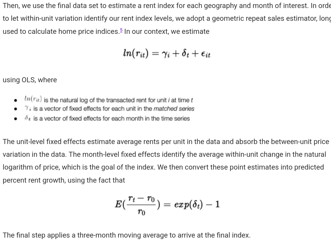
I have a PhD in mathematics and quite a bit of professional/academic experience in doing statistics (applied to house pricing, even!), and it took even me a little time to unpack the technical aspects of this model and see where it could be problematic. Without going into too much detail, the model makes a number of assumptions that, if violated, might make the entire thing useless:
- The last observed price of a unit is approximately equal to the transaction price.
- Removal of units from listings implies that there was a new lease. This might just come from gaps in the data.
- Parallel growth trends across unit types (e.g. luxury units had similar trends to other units). This impacts the growth rate, which is primarily what the authors are interested in.
- Census figures provide correct baselines.
- 3 month moving averages correctly reflect the price dynamics. This is an arbitrary time frame, and for a market which experiences shocks and seasonality, might not make sense at all.
- Units that repeatedly show up are reflective of the overall market. There might be selection bias associated to units that get relisted.
- Variables associated to things like renovation, amenities changes, etc. do not need to be included. This is almost certainly not the case, many units are relisted after changes to the unit happen in order to drive up the price.
- The adjustment for recent movers is correctly calculated.
- The standard mathematical assumptions for OLS regression are satisfied in order to make this mathematical model sensible. This is dubious.
The results of violating these assumptions may cut both ways: some would tend to produce overestimates and some would produce underestimates. The overall result is that the conceptual uncertainty around these assumptions produces completely unquantifiable uncertainty in the estimate. For something that’s meant to be a consistent index, this is potentially a fatal flaw. The article presents this unknowably-uncertain estimate as an objective measurement, which is incredibly dishonest.
I want to stress that flaws in this particular statistic invalidate huge swaths of this analysis - this non-measurement of price underlies many of their claims that they use to support their base argument that Austin’s rental prices dropped at all.
Causality
Finally, and most philosophically: even if you accept the premises that lead to accepting the data and meaningfulness of these charts, the causal implication that they want you to take from this is not even remotely justified. The implication of the title is that because more homes have been built, housing affordability has improved. This is logically flawed.
First, there are obvious and unaddressed phenomena lurking in the background: a shift in the tech-centered migration patterns after 2022 to/from Austin brought population growth down steeply and shifted the income demographics of people moving to the city.
Second, there’s the lack of obvious comparisons. A causal claim requires a counterfactual; in this case, the best we might hope for is an extremely similar city that was more or less identical to Austin besides the supposed choice to Build More. However, Austin was already an extreme outlier in the years building up to 2021, making any sort of national trends a poor choice of comparison. The best we might hope for are similar high-growth Sun Belt cities that didn’t build as much, but even there, the uniqueness of Austin’s shift in demand makes comparisons difficult.

Besides all that, there’s the basic issue of using this sort of correlational figure as causal at all. See this post for more details about this specific type of error in the context of causal inference, but at the end of the day, the only actual way to determine a causal relationship is via some form of experiment that involves randomness or quasi-experimental data that has been treated appropriately. The data being used here simply cannot provide this sort of analysis.
The Upshot
So, yeah, I hope that this is enough to make it clear that this article sucks and should not be taken particularly seriously. To bring it home, there are some points here that I want to be absolutely, 100% clear on:
- The YIMBY argument is oversimplified nonsense. This example is particularly boneheaded, but many other ones with the appearance of technical sophistication commit fancier versions of the same basic errors.
- Charts like the ones presented above provide absolutely no evidence of anything, and moreover they should not be used to suggest trends. You simply cannot use suggestive, correlational charts likes this to prove anything, and their use in this way is either dishonest or ignorant to this fact.
- If we are trying to be honest, these criticisms also need to apply to analyses whose conclusions we like.
- General readers who are trying to be honest need to have a bit of epistemic deference: if you cannot understand the technical aspects of an analysis, you are not qualified to judge its trustworthiness. Statistics is a technical field that requires serious, sustained study to master, and so this applies to most people (which is fine!). As a result, such laypeople simply should not take these numbers at face value, and would be better off reading more into the more obvious political economy associated to the motivations of those who are presenting these numbers.
Footnotes
-
Some of the reasons here will be rehashing of some of the important qualitative points in Harlo Pippinger’s broader article, which you should read. There are important local factors associated to Austin’s development that absolutely need to be considered, and he gives an excellent overview of several. ↩